The RentalTide brand
How we present RentalTide everywhere it appears: logo, color, type, voice, and imagery, with clear do's and don'ts.
Last Updated: Jun 23, 2026
Purpose
This brand guideline is the single set of standards we use to present RentalTide consistently across every public and private channel. Following it keeps our look, voice, and message recognizable everywhere, which maximizes brand recall and recognition with the operators we serve.
About the brand
Founded in 2025, RentalTide replaced clipboards and disconnected tools with one intelligent platform for rentals. We processed over $5M in GMV in year one and now serve 100+ locations with over $20M in GMV.
Our mission
Empower rental businesses to thrive through intelligent technology, so owners can focus on delivering exceptional customer experiences.
Our vision
A world where every rental operator, from one dock to a fleet, runs on one intelligent platform that grows with them.
Logo
Our logo is the RentalTide wordmark. Two color treatments exist so it always sits at full contrast against its background. Give it room and keep it unaltered.
A clean, modern sans-serif wordmark. The name is the mark.
"Tide" speaks to the dependable rhythm of a rental operation, bookings flowing in and out.
Confident and uncluttered, with the teal accent tying it to the palette.
Clear space and minimum size
- Keep clear space on all sides equal to at least the height of the wordmark.
- Never place the logo smaller than 24px tall on screen.
- Match the logo treatment to the background for full contrast.
Do
Don't
Color
Our palette is a deep near-black primary with a light secondary and a teal-to-cyan accent range. HEX, RGB, and CMYK are provided for digital and print consistency.
Primary colors
Secondary colors
Combinations and accessibility
Target WCAG AA: 4.5:1 for body text and 3:1 for large text and UI. Prefer Mist or white for body copy on dark. Teal and cyan are great accents, but avoid them as small text on light backgrounds.
Typography
Inter is our single typeface, used for both headings and body. It is open source, on Google Fonts, and self-hosted for performance.
Type hierarchy
Voice
RentalTide sounds like operators talking to operators: clear, confident, and genuinely useful. Every word should make the reader's job easier. One hard rule: we never use em dashes.
Plain-spoken
We write the way operators talk. No jargon, no filler, no buzzwords.
"Run bookings, payments, and your fleet in one place."
Confident, not loud
We let results speak. We skip hype, empty superlatives, and pressure tactics.
"Zero monthly fees. You pay only when you get paid."
Helpful first
We lead with what the reader gains, not with what we built.
"Go live in days, not months."
Human
Warm and direct, like a teammate on the dock who has your back.
"We will get you set up and stay with you after."
- "Run bookings, payments, and your fleet in one place."
- "Zero monthly fees. You pay only when you get paid."
- "Go live in days, not months."
- "Leverage our synergistic end-to-end paradigm."
- "Industry-leading, best-in-class, game-changing."
- "Act now, limited time, do not miss out."
Tone by channel
| Channel | Tone | Sample copy |
|---|---|---|
| Website / marketing | Confident, benefit-led | The AI-powered operations platform for rental businesses. |
| Product / UI | Clear, instructive, calm | Add your first boat to start taking bookings. |
| Support / help | Warm, patient, practical | Happy to help. Here is the quickest way to fix that. |
| Social | Friendly, human, light | Docks busy this weekend? Let the bookings run themselves. |
| Sales / email | Direct, no pressure | Worth a 15-minute look? I will tailor it to your fleet. |
Photography
Our photography is real and grounded: actual operators, real docks, real equipment. It should feel like a place you could walk up to, not a stock-photo studio.
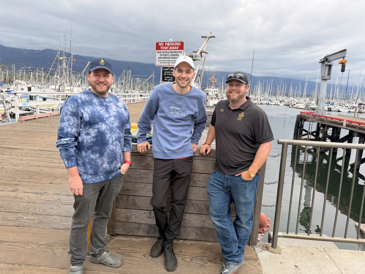
People
Authentic operators and team members, relaxed and approachable. Real smiles over posed corporate portraits.
Products
Equipment and the platform in real use: boats at the dock, a POS on the counter, the app in someone's hand.
Places
Marinas, waterfronts, and rental yards. Wide establishing shots that set the scene with natural, soft light.
Graphics
Graphic elements are minimal and functional, drawn straight from the UI system.
Calm and purposeful: gentle reveals on scroll and short, eased transitions. Nothing flashy or bouncy.
Icons
Icons come from Lucide (lucide-react in the product and site), which keeps the whole set consistent.
- Outline style, not solid.
- Consistent stroke around 1.5 to 2px.
- Common sizes 16, 20, 24px with even padding.
- Teal for emphasis, muted gray for default.
Charts
Data should feel calm and on-brand. Teal is the primary data color; add hues only when you need to separate series.
Brand applications
The elements together in the real world. Treat this as the show, don't tell library for applying the brand consistently.
Digital
- Website and landing pages
- Press and media kit
- Product UI, web and mobile
- Social and email
- One-pagers and sell sheets
- Trade show and event signage
- Business cards and stickers
Other
- App store listings
- Partner and integration co-branding
- Branded apparel on location
Need an asset?
For logos, additional formats, or anything not covered here, reach out and we will help.
press@rentaltide.com